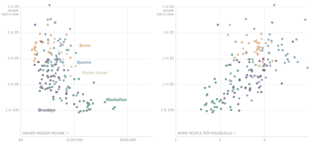
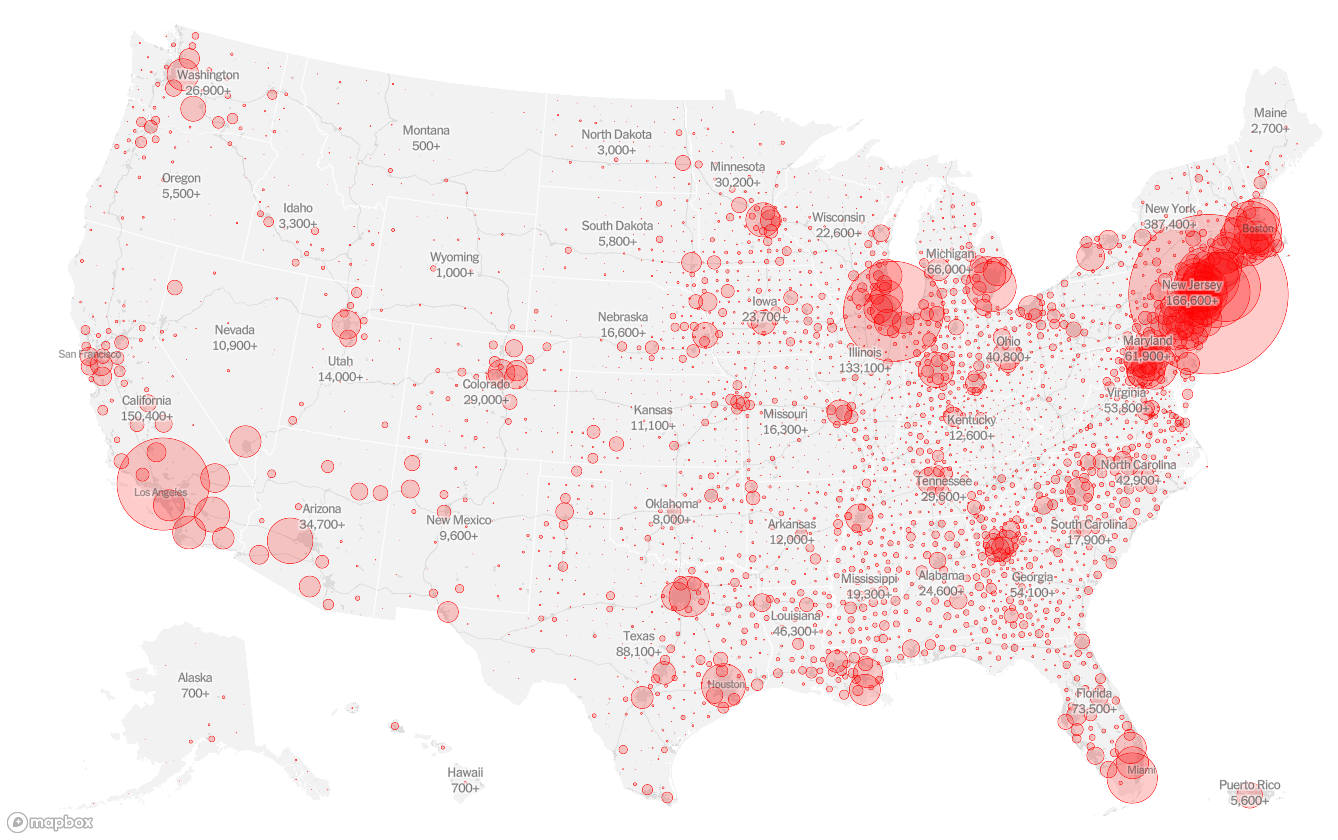
Geospatial plot of cases per capita in NYC and an interactive scatter plot finding the relationship between median income, average household size & cases per capita.
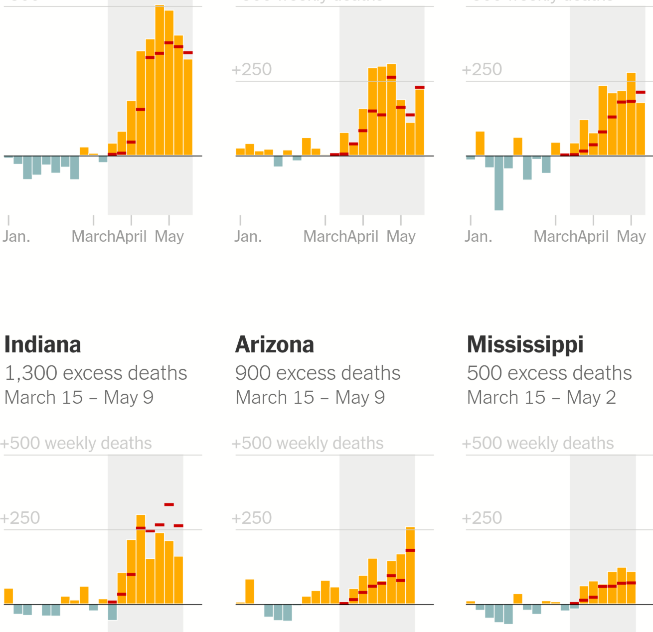
Making a layered chart comprising an bar chart of weekly excess deaths, a tick chart of weekly COVID-19 deaths and a rectangle chart highlighting the timeperiod when the pandemic tore through the states and cities.
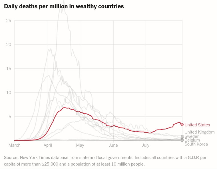
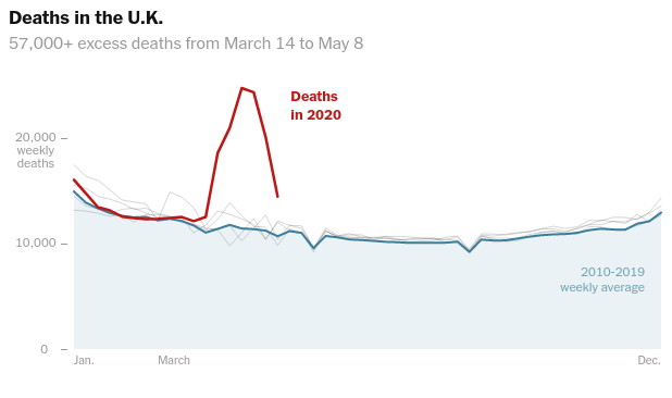
Tracking the True Toll of the Coronavirus Outbreak. Making a layered chart comprising an area chart of yearly average deaths per week, and multiple line charts showing weekly death trends per year, in various countries.
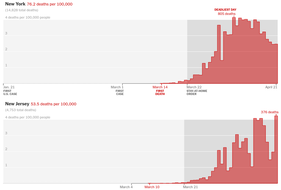
Making a layered chart comprising a step area chart of deaths per day, and a rectangle chart starting from the day of Stay at Home Order for states in the U.S
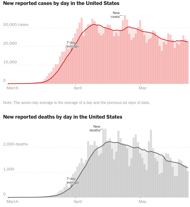
Making a vertically concatenated layered chart. The layered chart comprises a bar chart of new cases, a line and area chart of a week's average of COVID-19 cases and deaths in the U.S for the vertical charts respectively.