Relation b/w median income, average household size & cases per capita in NYC
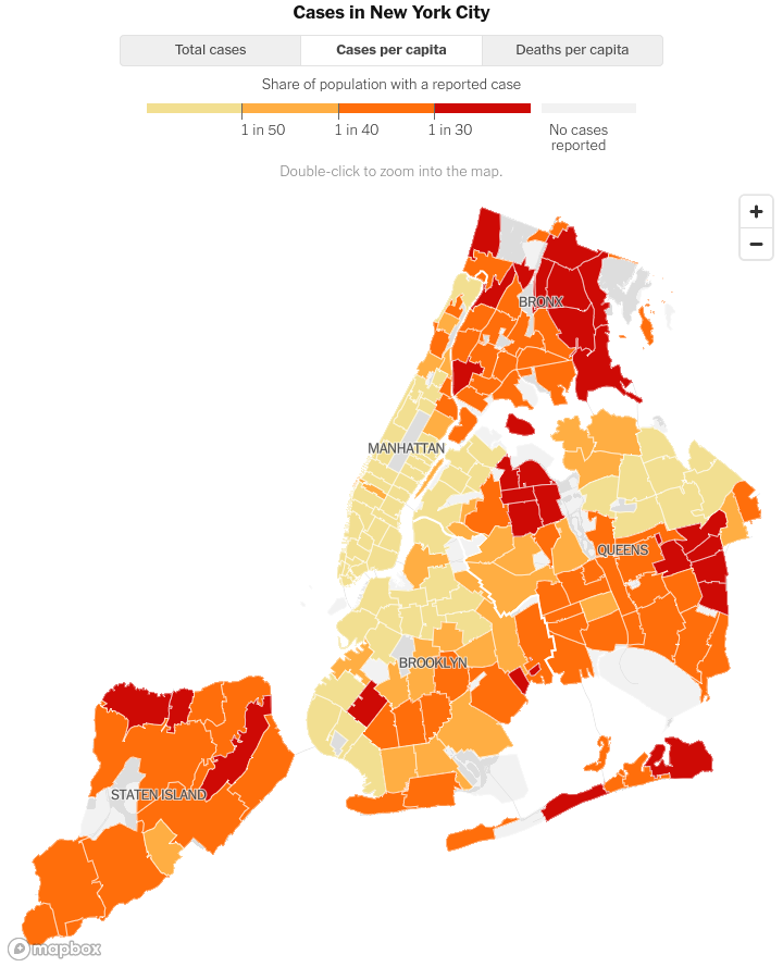
Geospatial plot of cases per capita in NYC and an interactive scatter plot finding the relationship between median income, average household size & cases per capita.

Today we will make the plots that are present in this webpage that tracks the situation in New York City - New York City Coronavirus Map and Case Count
There are two main plots -
- Cases per capita
- Plot analyzing the relationship b/w average household size, income and cases per capita
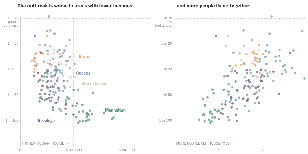
They have since corrected the graph -
#hide_output
import pandas as pd
import altair as alt
import geopandas as gpd
alt.renderers.set_embed_options(actions=False)
Fortunately NYC Department of Health and Mental Hygiene publishes their data in their GitHub Repo. It has all the data from cases to the shapefiles too.
But we will use the data from NYC Open Data which is equally good. We will use the NYC Department of Health and Mental Hygiene GitHub repo only for their COVID data per MODZCTA.
The location of the dataset on NYC Open Data portal is https://data.cityofnewyork.us/Health/Modified-Zip-Code-Tabulation-Areas-MODZCTA-/pri4-ifjk which we will export as geojson.
import requests
resp = requests.get('https://data.cityofnewyork.us/api/geospatial/pri4-ifjk?method=export&format=GeoJSON')
data = resp.json()
nyc_zip = gpd.GeoDataFrame.from_features(data['features'])
nyc_zip.head()
# If you have the data locally
#modzcta = 'MODZCTA/Modified Zip Code Tabulation Areas.geojson'
#nyc_zip_shp = gpd.read_file(modzcta)
This is how it looks when colored based on population -
alt.Chart(nyc_zip).mark_geoshape().encode(
color='pop_est:Q'
)
Now we will get the Median Household Income data from Census Reporter's wonderful website. In particular the url query for the 5 boroughs in NYC is https://censusreporter.org/data/table/?table=B19013&geo_ids=860%7C05000US36061,860%7C05000US36047,860%7C05000US36081,860%7C05000US36005,860%7C05000US36085 which I came to know thanks to this comment in NYC Health covid data repo.
Download it and export it to work with it further (I chose the Shapefile, but I suppose others would be fine too).
median_income_path = 'MODZCTA/median_income_nyc/acs2018_5yr_B19013_86000US11417/acs2018_5yr_B19013_86000US11417.shp' #push it to datasets repo and link here
median_income = gpd.read_file(median_income_path)
median_income.head()
The regions in median income data that are not part of NTC's modzcta can be seen as follows(basically we are finding out if both datasets show the same regions) -
median_income[median_income['name'].isin(nyc_zip['modzcta']) == False].plot()

Fun Fact - the areas marked above are also NOT SHOWN in NYT's Charts
If you want you can plot the Median Income Data too using -
alt.Chart(median_income).mark_geoshape().encode(
color='B19013001:Q'
)
Now we will get the COVID data per MODZCTA
covid_zip_uri = 'https://raw.githubusercontent.com/nychealth/coronavirus-data/master/data-by-modzcta.csv'
covid_zip = pd.read_csv(covid_zip_uri)
covid_zip.head()
Merge the covid data with NYC shapefile data to be able to see the number of cases per modzcta
def modify_merge(nyc_zip, covid_zip):
covid_zip = covid_zip.loc[:, ['MODIFIED_ZCTA', 'BOROUGH_GROUP', 'COVID_CASE_COUNT', 'COVID_DEATH_COUNT', 'NEIGHBORHOOD_NAME']]
nyc_zip['pop_est'] = nyc_zip['pop_est'].astype(int)
nyc_zip['modzcta'] = nyc_zip['modzcta'].astype(int)
covid_zip.rename(columns = {'MODIFIED_ZCTA': 'modzcta'}, inplace=True)
covid_nyc_zip = nyc_zip.merge(covid_zip, how='left', on='modzcta')
return covid_nyc_zip
covid_nyc_zip = modify_merge(nyc_zip, covid_zip)
covid_nyc_zip.head()
Customary covid cases visualization per modfied zip code tabulation area -
alt.Chart(covid_nyc_zip).mark_geoshape().encode(
color='COVID_CASE_COUNT'
)
Now we will merge median income data with the covid cases per zip code tabulation area data we just derieved above -
def modify_merge(covid_nyc_zip, median_income):
median_income.rename(columns={'name': 'modzcta', 'B19013001': 'median_income'}, inplace=True)
median_income['modzcta'] = median_income['modzcta'].astype(int)
median_income = median_income.drop(columns=['geometry', 'B19013001e'])
covid_income_zip = covid_nyc_zip.merge(median_income, how='inner', on='modzcta')
covid_income_zip = covid_income_zip.assign(
#case_per_people = covid_income_zip['COVID_CASE_COUNT']/covid_income_zip['POP_DENOMINATOR'], #their earlier calculation
case_per_people = covid_income_zip['COVID_CASE_COUNT']/covid_income_zip['pop_est'], # current calculation
)
return covid_income_zip
covid_income_zip = modify_merge(covid_nyc_zip, median_income)
covid_income_zip.head()
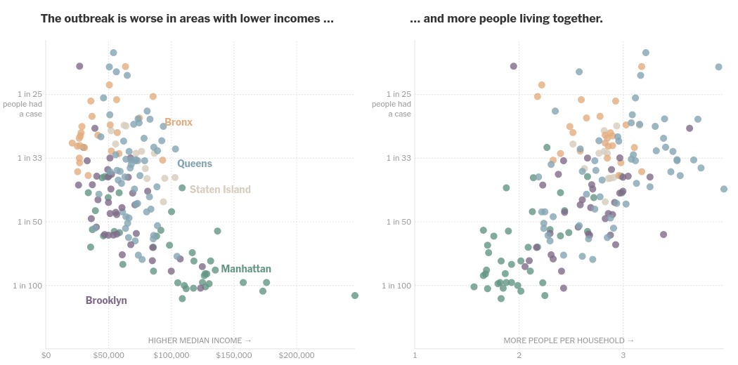
Now let's plot this data and we will find that it exactly MATCHES NYT's chart for cases per people v/s median income -
alt.Chart(covid_income_zip).mark_circle().encode(
color=alt.Color('median_income:Q', sort = "descending"),
x=alt.X('median_income:Q'),
y='case_per_people:Q'
)
This data can be calculated from Household Type by Household Size data, again from Census Reporter - the url query would be https://censusreporter.org/data/table/?table=B11016&geo_ids=860|05000US36061,860|05000US36047,860|05000US36081,860|05000US36005,860|05000US36085
Getting data like these honestly deserves its own blog post. It took me a very long time to find the proper data. Perhaps I will write about it some other time.
household_path = 'MODZCTA/household_type_by_household_size/csvofsame/acs2018_5yr_B11016_86000US11417.csv'
household = pd.read_csv(household_path)
household.head()
def consolidated_household_per_zip(df):
household_data = pd.DataFrame()
household_data = household_data.assign(
one_person = df['1-person nonfamily household'],
two_person = df['2-person household'] + df['2-person nonfamily household'],
three_person = df['3-person household'] + df['3-person nonfamily household'],
four_person = df['4-person household'] + df['4-person nonfamily household'],
five_person = df['5-person household'] + df['5-person nonfamily household'],
six_person = df['6-person household'] + df['6-person nonfamily household'],
seven_or_more_person = df['7 or more-person household'] + df['7 or more-person nonfamily household'],
modzcta = df['name'],
total = df['Total']
#avg_people_per_household = df.apply(lambda x: (x[1]+2*x[2]+3*x[3]+4*x[4]+5*x[5]+6*x[6]+7*x[7])/(x['total']), axis=1)
)
return household_data
household_data = consolidated_household_per_zip(household)
household_data.head()
Now we will merge the household data too to arrive at the final data for plotting -
plot_data = covid_income_zip.merge(household_data, how='inner', on='modzcta')
Calculating Average people per household is simple enough, jsut divide the population with the number of households -
plot_data['avg_person_per_household'] = plot_data['pop_est']/plot_data['total']
Finally let's plot the data side by side - horizontal concatenatioon using | operator -
income = alt.Chart(plot_data).mark_circle().encode(
color=alt.Color('median_income:Q', sort = "descending"),
x=alt.X('median_income:Q'),
y='case_per_people:Q'
)
household_size = alt.Chart(plot_data).mark_circle().encode(
#color=alt.Color('median_income:Q', sort = "descending"),
x=alt.X('avg_person_per_household:Q'),
y='case_per_people:Q'
)
income|household_size
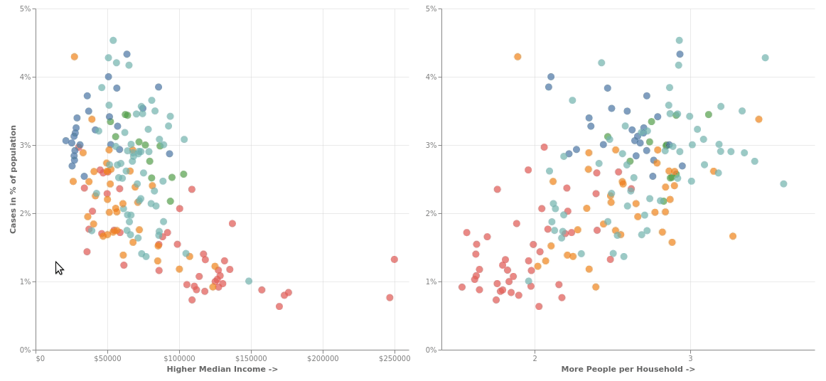
Let's beautify it a little and add interactivity so that whenever you select an area in one of the graphs, the corresponding points gets highlighted in the second graph and you can drag the selection around to see that actually that the outbreak is worse in poorer areas where more people live together.
brush = alt.selection_interval(encodings=['x'])
chart = alt.Chart(plot_data).mark_circle(size=100).encode(
color=alt.condition(brush, 'BOROUGH_GROUP:N', alt.value('lightgray'), legend=alt.Legend(title="Borough")),
y=alt.Y('case_per_people:Q')
).add_selection(brush).properties(width=525, height=480)
alt.hconcat(
chart.encode(
x=alt.X('median_income:Q', axis=alt.Axis(tickCount=3, format="$d",titleOpacity=0.6, title='Higher Median Income ->')),
y=alt.Y('case_per_people:Q', axis=alt.Axis(format="%",titleOpacity=0.6, tickCount=4, title="Cases in % of population"))
),
chart.encode(
x=alt.X('avg_person_per_household:Q', scale=alt.Scale(zero=False), axis=alt.Axis(tickCount=3,titleOpacity=0.6, title='More People per Household ->')),
y=alt.Y('case_per_people:Q', axis=alt.Axis(format="%", tickCount=4, title=None))
)
).configure_view(strokeWidth=0).configure_axis(grid=True,gridOpacity=0.6,labelOpacity=0.5)
Way to reproduce the old incorrect graph -
Get the total population data as 1*(1 person households) + .... + 7*(7 or more person households)
Hope you noticed the error over there, but it perfectly captures the old graph as you can see in my old tweet which I had implemented that way -
Working on my next set of #dataviz. The regions in NYC with high cases per capita are also regions with the lowest median incomes and largest average household size. Inspired by @nytgraphics and made using #Python and #altair
— Shantam Raj (@RajShantam) July 4, 2020
Follow the blog 👉 https://t.co/JfXtHy5hPh pic.twitter.com/QawWEEgb4B
Gif of the above implementation -
Since we have the data in order, - we will use the covid_income_zip data beause it already has the "case_per_people" field that we have to plot - potting is as simple as -
alt.Chart(covid_income_zip).mark_geoshape().encode(
color='case_per_people'
)
Using their color scheme -
def color_it(x):
if x<(1/50):
return "less than 1/50"
elif x<(1/40):
return "1/50 to 1/40"
elif x<(1/30):
return "1/40 to 1/30"
else:
return "more than 1/30"
covid_income_zip = covid_income_zip.assign(share_of_population=covid_income_zip['case_per_people'].apply(color_it))
alt.Chart(covid_income_zip).mark_geoshape().encode(
color=alt.Color('share_of_population', scale=alt.Scale(domain=['less than 1/50', '1/50 to 1/40', '1/40 to 1/30', 'more than 1/30'], range=['#f2df91', '#ffae43', '#ff6e0b', '#ce0a05']))
).properties(width=600, height=600)
I love this part - time for some actual spatial analysis. To show the Borough names we will actually dissolve the areas by borough and get the centroid and finally place our text mark there
borough = covid_income_zip.dissolve(by='BOROUGH_GROUP')
borough['lon'] = borough['geometry'].centroid.x
borough['lat'] = borough['geometry'].centroid.y
borough = borough.reset_index()
borough
Let's plot it and put the legend on top -
a = alt.Chart(covid_income_zip).mark_geoshape().encode(
color=alt.Color(
'share_of_population',
scale=alt.Scale(domain=['less than 1/50', '1/50 to 1/40', '1/40 to 1/30', 'more than 1/30'], range=['#f2df91', '#ffae43', '#ff6e0b', '#ce0a05']),
legend=alt.Legend(title="Share of Population", orient='top', symbolType='square', columnPadding=20, symbolSize=200)
),
tooltip = ['BOROUGH_GROUP', 'NEIGHBORHOOD_NAME', 'modzcta', 'COVID_CASE_COUNT', 'COVID_DEATH_COUNT']
).properties(width=600, height=600)
b = alt.Chart(borough).mark_text().encode(
longitude='lon',
latitude='lat',
text='BOROUGH_GROUP:N'
)
a+b