Rapidly emulating professional visualizations from The New York Times in Python using Altair
EXPECTATIONS
 |
 |
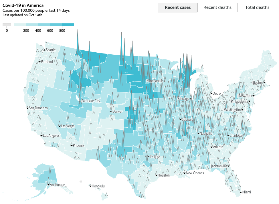
| NYT | The Economist |
|---|---|
 |
 |
ALTAIR
Altair is a declarative statistical visualization library for Python, based on Vega-Lite and the Grammar of Graphics paradigm.
VEGA-LITE
Vega-Lite is a high-level grammar of interactive graphics.
| JSON Spec | Output Plot |
|---|---|
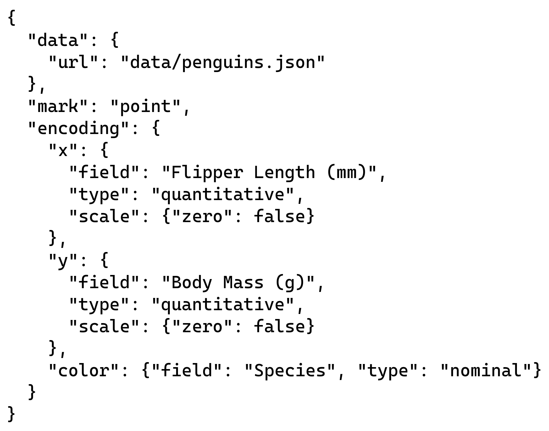 |
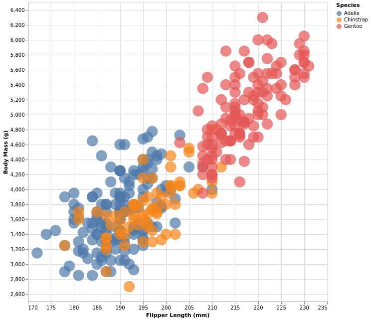 |
Grammar of Graphics
Fundamental Building Blocks
- Data
- Transformation
- Marks
- Encoding
- Scale
- Guides
Declarative Visualization
Declare What instead of implementing How
Takeaway
- Altair is to Python as ggplot2 is to R
- Quick, concise and intuitive
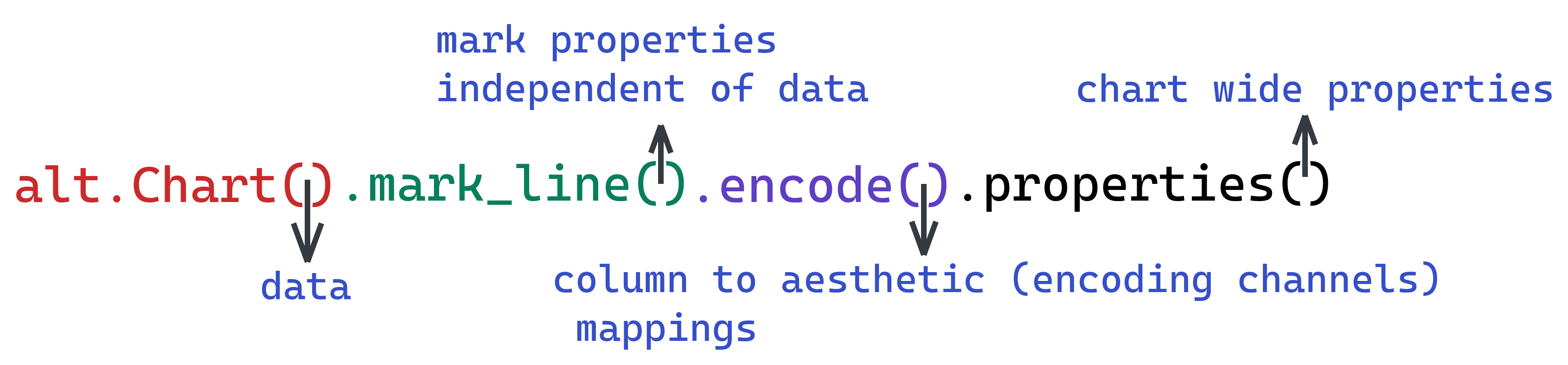
Creating a visualization in Altair - Pattern

MARKS
Basic Marks
mark_area- Area chartsmark_bar- Bar chartsmark_point- Scatterplotsmark-geoshape- Mapsmark_line- Line Chartsmark_rule- Horizontal and Vertical Linesmark_rect- Heatmapsmark_text- Text Charts
Composite Marks
mark_boxplot- Box Plotsmark_errorbar- Errorbar around a pointmark_errorband- Errorband around a line
ENCODING CHANNELS
General
xylongitudelatitudecolorsizetooltip
Subplots
columnrowfacet
ENCODING DATA TYPES
| Data Type | Shorthand Code | Description |
|---|---|---|
| quantitative | Q |
a continuous real-valued quantity |
| ordinal | O |
a discrete ordered quantity |
| nominal | N |
a discrete unordered category |
| temporal | T |
a time or date value |
| geojson | G |
a geographic shape |
WEATHER DATA EXPLORATION
import altair as alt
import pandas as pd
weather_data = "https://github.com/vega/vega-datasets/blob/master/data/weather.csv?raw=True"
data = pd.read_csv(weather_data)
data['date'] = pd.to_datetime(data['date'])
data.head()
| location | date | precipitation | temp_max | temp_min | wind | weather | |
|---|---|---|---|---|---|---|---|
| 0 | Seattle | 2012-01-01 | 0.0 | 12.8 | 5.0 | 4.7 | drizzle |
| 1 | Seattle | 2012-01-02 | 10.9 | 10.6 | 2.8 | 4.5 | rain |
| 2 | Seattle | 2012-01-03 | 0.8 | 11.7 | 7.2 | 2.3 | rain |
| 3 | Seattle | 2012-01-04 | 20.3 | 12.2 | 5.6 | 4.7 | rain |
| 4 | Seattle | 2012-01-05 | 1.3 | 8.9 | 2.8 | 6.1 | rain |
alt.Chart(data).mark_point().encode(
x = 'date',
y = 'temp_max',
column = 'location'
)
Let's give different colors to each location
alt.Chart(data).mark_point().encode(
x = 'date',
y = 'temp_min',
column = 'location',
color = 'location'
)
I wonder what the distribution of temperature_maximum is for both locations? How do we arrive at that? Well x axis stays the same, on y axis we say the count of temp_max and we do not facet!
alt.Chart(data).mark_bar().encode(
x = 'temp_max',
y = 'count(temp_max)'
)
COMPOUND CHARTS
- +
- |
- &
scatter = alt.Chart(data).mark_point().encode(
x = 'precipitation',
y = 'wind'
)
regression = alt.Chart(data).transform_regression('precipitation', 'wind').mark_line().encode(
x = 'precipitation',
y = 'wind'
)
scatter | regression
LAYERING
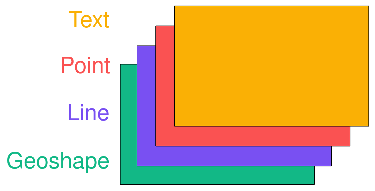
scatter + regression.mark_line(color="red")
VISUALIZING NYT's COVID DATASET
import altair as alt
import pandas as pd
import geopandas as gpd
us_covid_data_uri = 'https://github.com/nytimes/covid-19-data/blob/master/us-counties.csv?raw=true'
raw_data = pd.read_csv(us_covid_data_uri)
raw_data['date'] = pd.to_datetime(raw_data['date'])
covid = raw_data.copy()
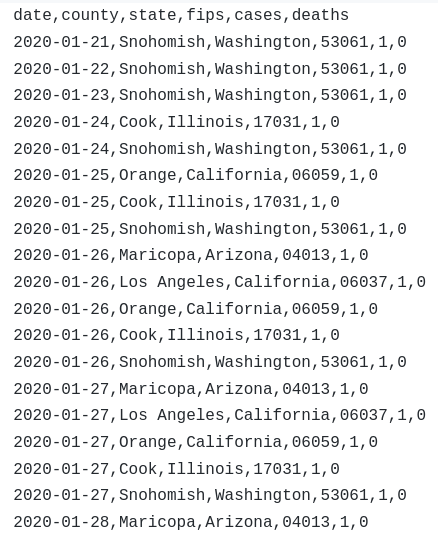
covid.head()
| date | county | state | fips | cases | deaths | |
|---|---|---|---|---|---|---|
| 0 | 2020-01-21 | Snohomish | Washington | 53061.0 | 1 | 0 |
| 1 | 2020-01-22 | Snohomish | Washington | 53061.0 | 1 | 0 |
| 2 | 2020-01-23 | Snohomish | Washington | 53061.0 | 1 | 0 |
| 3 | 2020-01-24 | Cook | Illinois | 17031.0 | 1 | 0 |
| 4 | 2020-01-24 | Snohomish | Washington | 53061.0 | 1 | 0 |
MAPS
Shapefiles from US Census Website
county_shpfile = './cb_2019_us_county_20m'
county = gpd.read_file(county_shpfile)
Adding longitude and latitude in the data
We need to have longitude and latitude so that the marks are positioned where they are supposed to be
county['lon'] = county['geometry'].centroid.x
county['lat'] = county['geometry'].centroid.y
<class 'geopandas.geodataframe.GeoDataFrame'>
RangeIndex: 3220 entries, 0 to 3219
Data columns (total 4 columns):
# Column Non-Null Count Dtype
--- ------ -------------- -----
0 fips 3220 non-null int64
1 geometry 3220 non-null geometry
2 lon 3220 non-null float64
3 lat 3220 non-null float64
dtypes: float64(2), geometry(1), int64(1)
memory usage: 100.8 KBalt.Chart(county).mark_geoshape().encode().properties(width=800, height=600)
alt.Chart(county).mark_geoshape().encode().properties(width=800, height=600).project('albersUsa')
2019 Population Data from Census
Take the data for today's date
plot_data = covid[covid['date'] == '2020-10-15']
Divide "cases" and "deaths" by population estimates and multiply by 1000
Merge all to the geodataframe
We need the geometry column so that we can make plots
plot_data.head()
| fips | geometry | lon | lat | date | county | state | cases | deaths | POPESTIMATE2019 | cases_per_capita | |
|---|---|---|---|---|---|---|---|---|---|---|---|
| 0 | 29227 | POLYGON ((-94.63203 40.57176, -94.53388 40.570... | -94.423288 | 40.479456 | 2020-10-16 | Worth | Missouri | 26 | 0 | 2013 | 12.916046 |
| 1 | 31061 | POLYGON ((-99.17940 40.35068, -98.72683 40.350... | -98.952991 | 40.176363 | 2020-10-16 | Franklin | Nebraska | 70 | 0 | 2979 | 23.497818 |
| 2 | 36013 | POLYGON ((-79.76195 42.26986, -79.62748 42.324... | -79.366918 | 42.227692 | 2020-10-16 | Chautauqua | New York | 771 | 4 | 126903 | 6.075506 |
| 3 | 37181 | POLYGON ((-78.49773 36.51467, -78.45728 36.541... | -78.406712 | 36.368814 | 2020-10-16 | Vance | North Carolina | 1135 | 46 | 44535 | 25.485573 |
| 4 | 47183 | POLYGON ((-88.94916 36.41010, -88.81642 36.410... | -88.719909 | 36.298962 | 2020-10-16 | Weakley | Tennessee | 1404 | 23 | 33328 | 42.126740 |
alt.Chart(plot_data).mark_geoshape().encode(
color = 'cases_per_capita'
).project('albersUsa').properties(width=800, height=700)
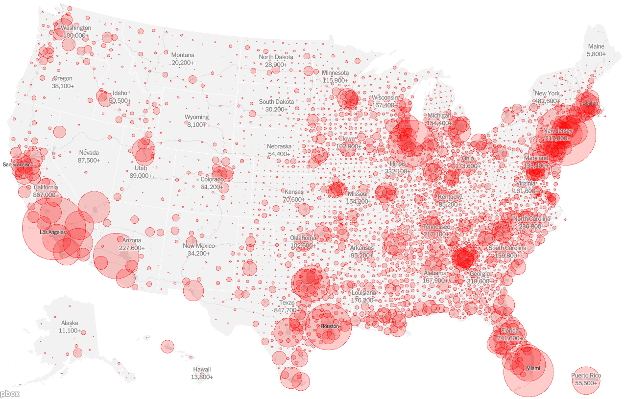
Covid Cases in USA
base = alt.Chart(county).mark_geoshape().encode().project('albersUsa')
circles = alt.Chart(plot_data).mark_circle(
fillOpacity=0.5,
fill='red',
stroke='red'
).encode(
size='cases',
longitude='lon',
latitude='lat'
).project('albersUsa')
base + circles
size = alt.Size('cases', scale = alt.Scale(domain=[0, 10000]))
base + circles
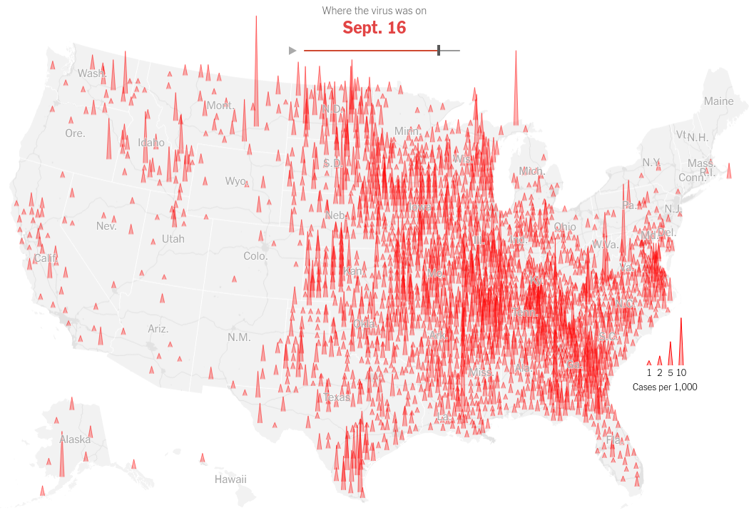
SVG Path
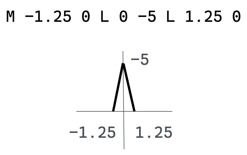
base = alt.Chart(county).mark_geoshape(fill='#ededed', stroke='white').encode().project('albersUsa')
spikes = alt.Chart(cases_plot_data).mark_point(
fillOpacity = 0.5,
fill = 'red',
strokeWidth = 1,
stroke = 'red',
shape = "M -1.25 0 L 0 -5 L 1.25 0"
).encode(
size = 'cases:Q',
longitude = 'lon:Q',
latitude = 'lat:Q',
tooltip = ['county', 'state', 'cases']
).project('albersUsa').properties(width=1000, height=700)
base + spikes
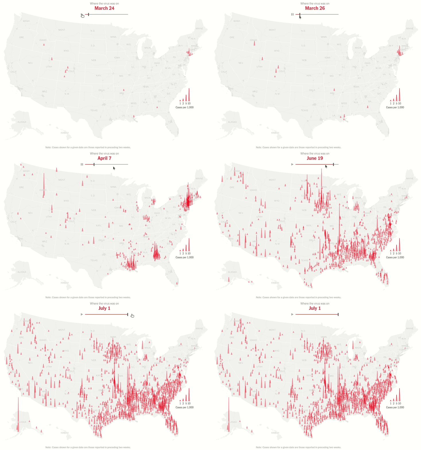
Humans perceive changes in AREA better
- Spike - closer to a bar in a bar chart
- Height sufficiently represents cases/deaths
- How to scale it across only Y-axis and not X-axis?
- Vega-Lite does not have
scaleYencoding, hence Altair does not support that either
Bypass changes in area by manually specifying SCALE via a new column on SHAPE encoding
Make SVG Path string column
plot_data_spike.head()
| date | county | state | fips | cases | deaths | lon | lat | height | |
|---|---|---|---|---|---|---|---|---|---|
| 269 | 2020-10-16 | Snohomish | Washington | 53061.0 | 9125 | 231 | -121.717177 | 48.046183 | M -1.25 0 L 0 -3.0416666666666665 L 1.25 0 |
| 548 | 2020-10-16 | Cook | Illinois | 17031.0 | 160645 | 5340 | -87.816577 | 41.841467 | M -1.25 0 L 0 -53.54833333333333 L 1.25 0 |
| 826 | 2020-10-16 | Orange | California | 6059.0 | 58354 | 1401 | -117.764588 | 33.701506 | M -1.25 0 L 0 -19.451333333333334 L 1.25 0 |
| 1103 | 2020-10-16 | Maricopa | Arizona | 4013.0 | 148612 | 3500 | -112.491834 | 33.348403 | M -1.25 0 L 0 -49.537333333333336 L 1.25 0 |
| 1380 | 2020-10-16 | Los Angeles | California | 6037.0 | 287222 | 6855 | -118.228247 | 34.308286 | M -1.25 0 L 0 -95.74066666666667 L 1.25 0 |
base + spikes
Explicitely set SCALE to None
- Vega-Lite allows us to scale our data using custom fields.
- Since
mark_pointsupports custom SVG paths, we make a new column in our data as an SVG string - Map that column to
shapeencoding channel withscaleset toNone- do not apply any defaults, use exactly what I am giving. - But in all honesty it was necessary to do this to be able to recreate the NYT chart !
shape = alt.Shape('height', scale=None)
base + spikes
Use Selections and Bindings
Make interactive charts just as easily using a grammatical and declarative approach
Change looks in Jupter Notebook
VSCode -> Electron
JupyterLab -> Browser
It's all HTML CSS and JS
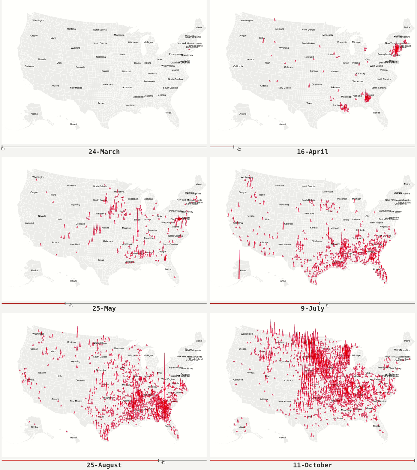
This chart only shows places on a given date where cases in the past two weeks per capita exceeds 2.5 (arbitrary choice), to get an idea about where the infections are spreading most rapidly.
SUMMARY / TAKEAWAYS
- Reflect on how we created these viz in a declarative manner instead of worrying about how to implement it
- The key idea is that you are declaring links between data columns and visual encoding channels, such as the x-axis, y-axis, color, etc. The rest of the plot details are handled automatically.
- If you are thinking of transitioning from R to Python, now you have a very compelling reason!
- You to make interactive charts too using the same declarative grammar.
- Your visualizations are ready for the web - out of the box - using Vega-Embed.
RESOURCES
- Slides, Notebook and Speaker Notes - GitHub Repo
- COVID Viz (Recreations of many charts that appeared in media articles) Repo & Website
- Interactive Viz Website
- Altair Tutorial - PyCon 2018
- Altair Viz Notebooks by UW
- Altair Website
CONTACT
- GitHub - https://github.com/armsp
- Twitter - @RajShantam
- Website - https://www.shantamraj.com
- LinkedIn - https://www.linkedin.com/in/shantam-raj/